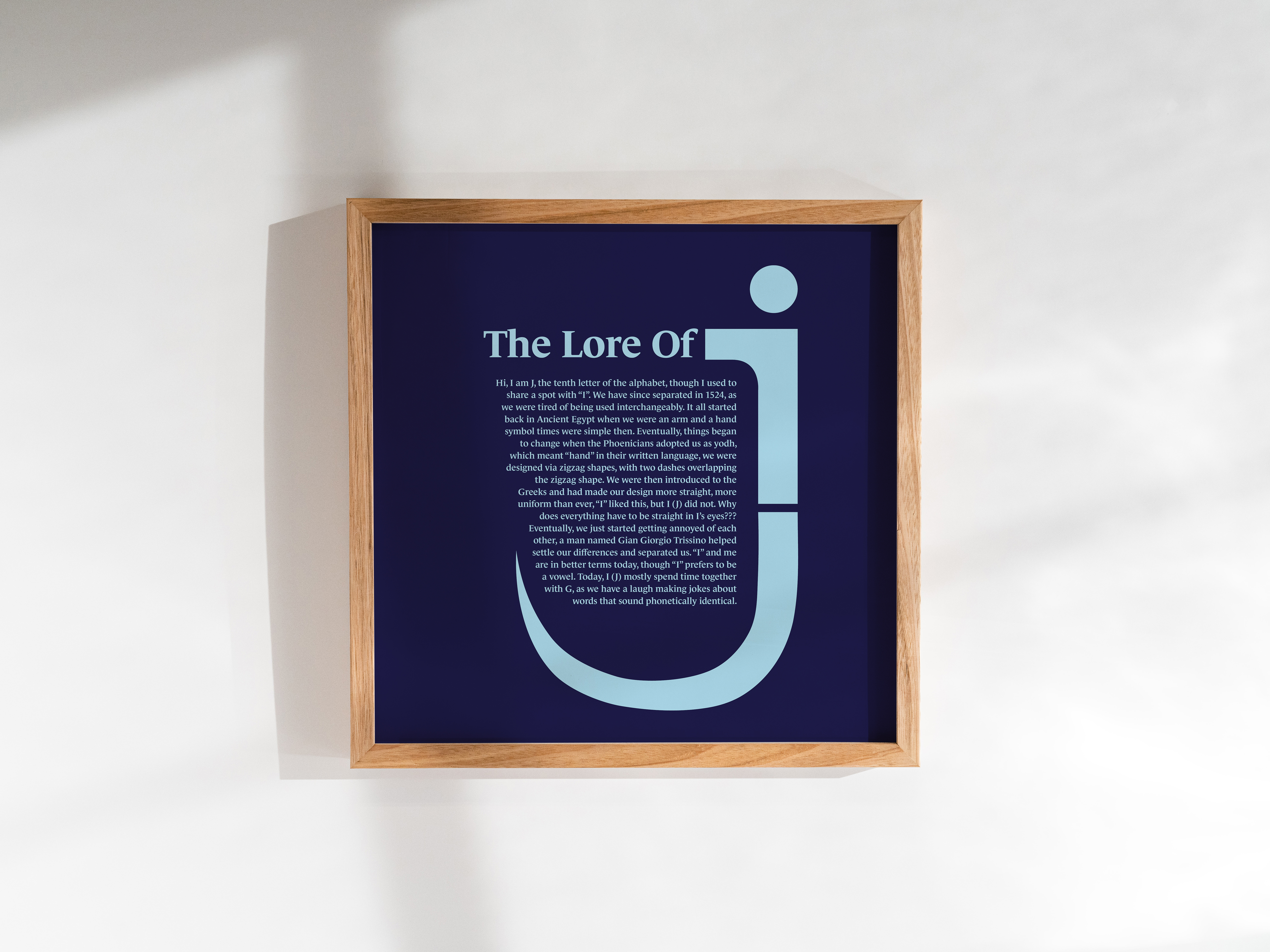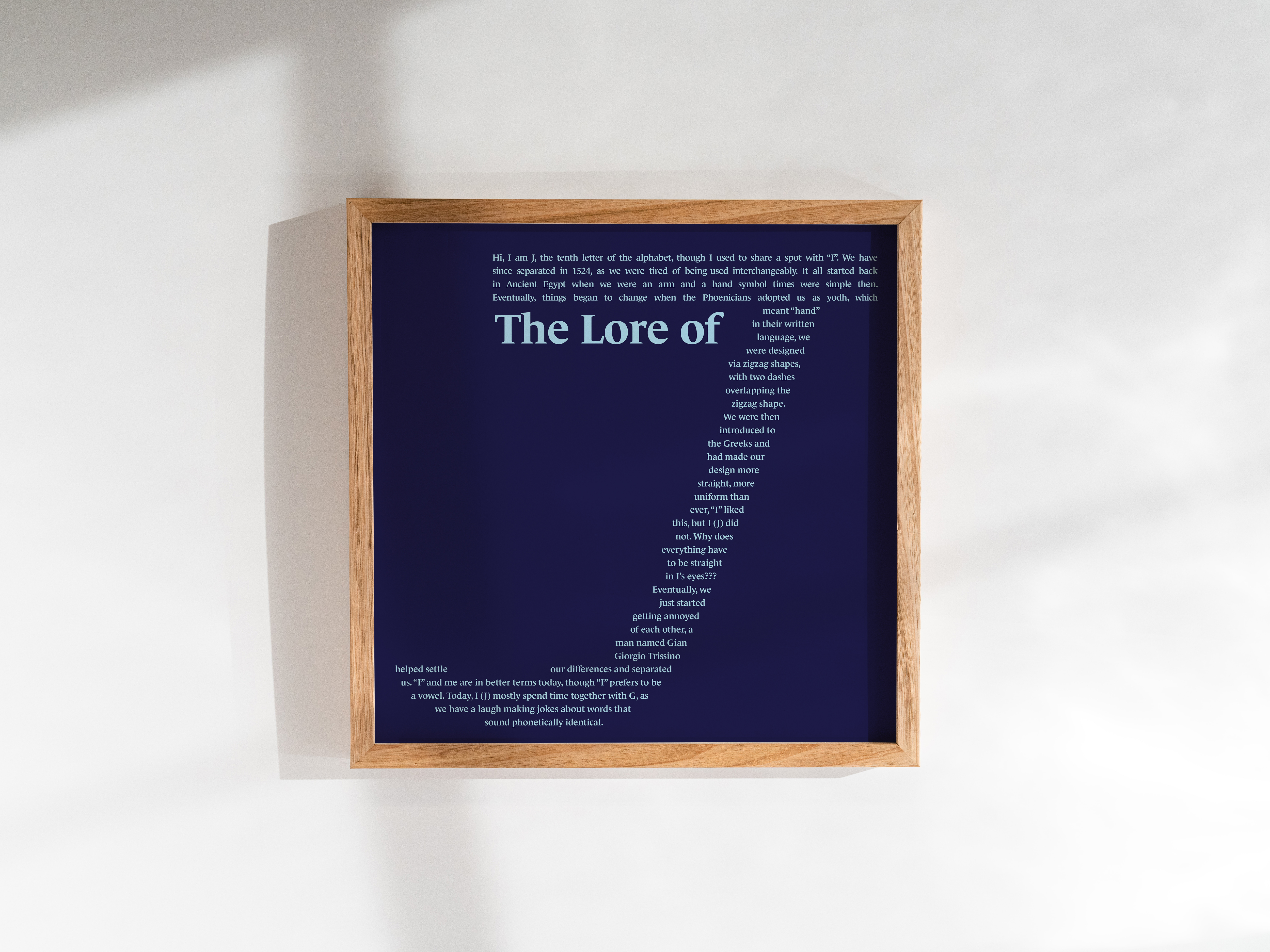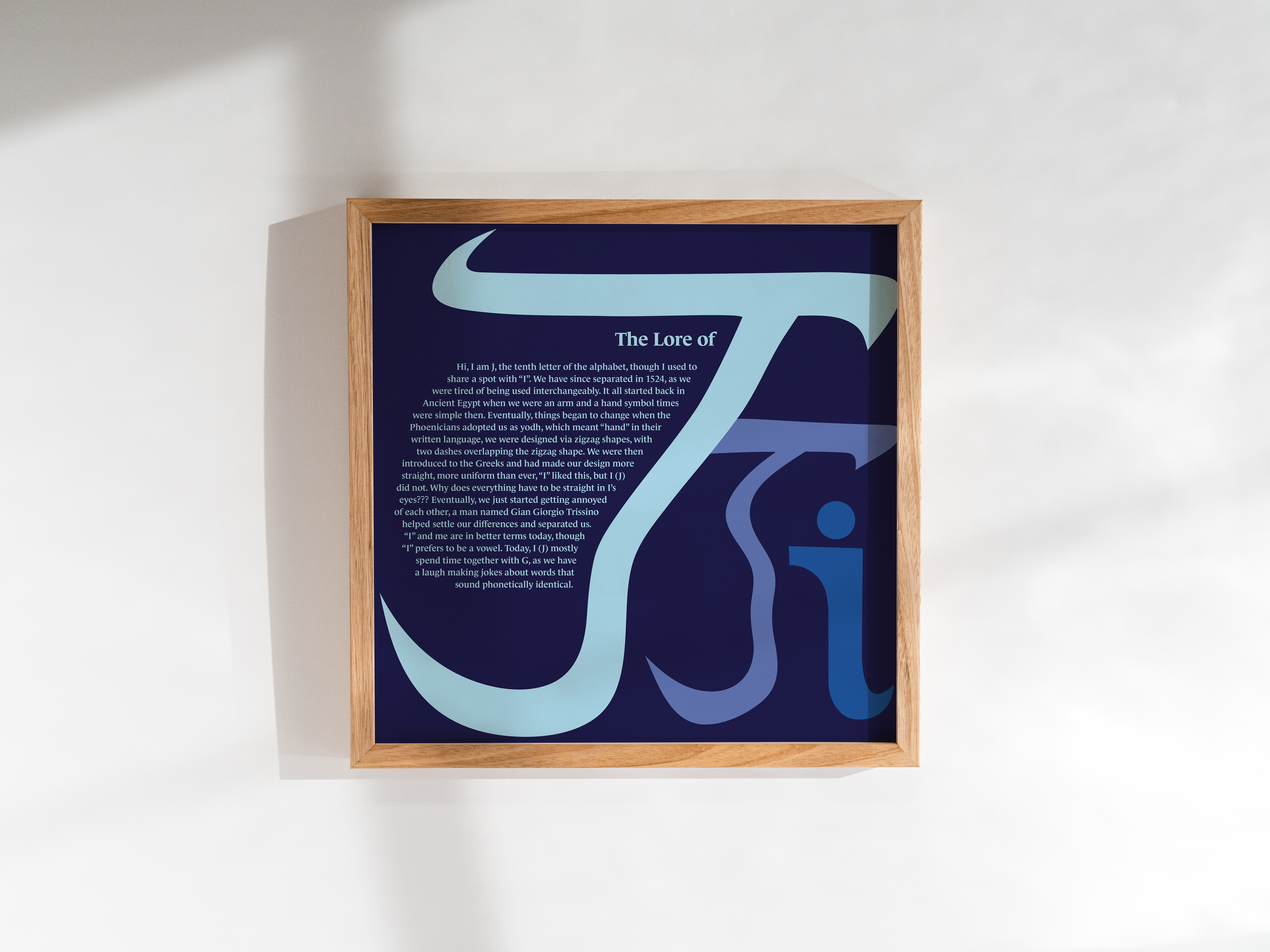
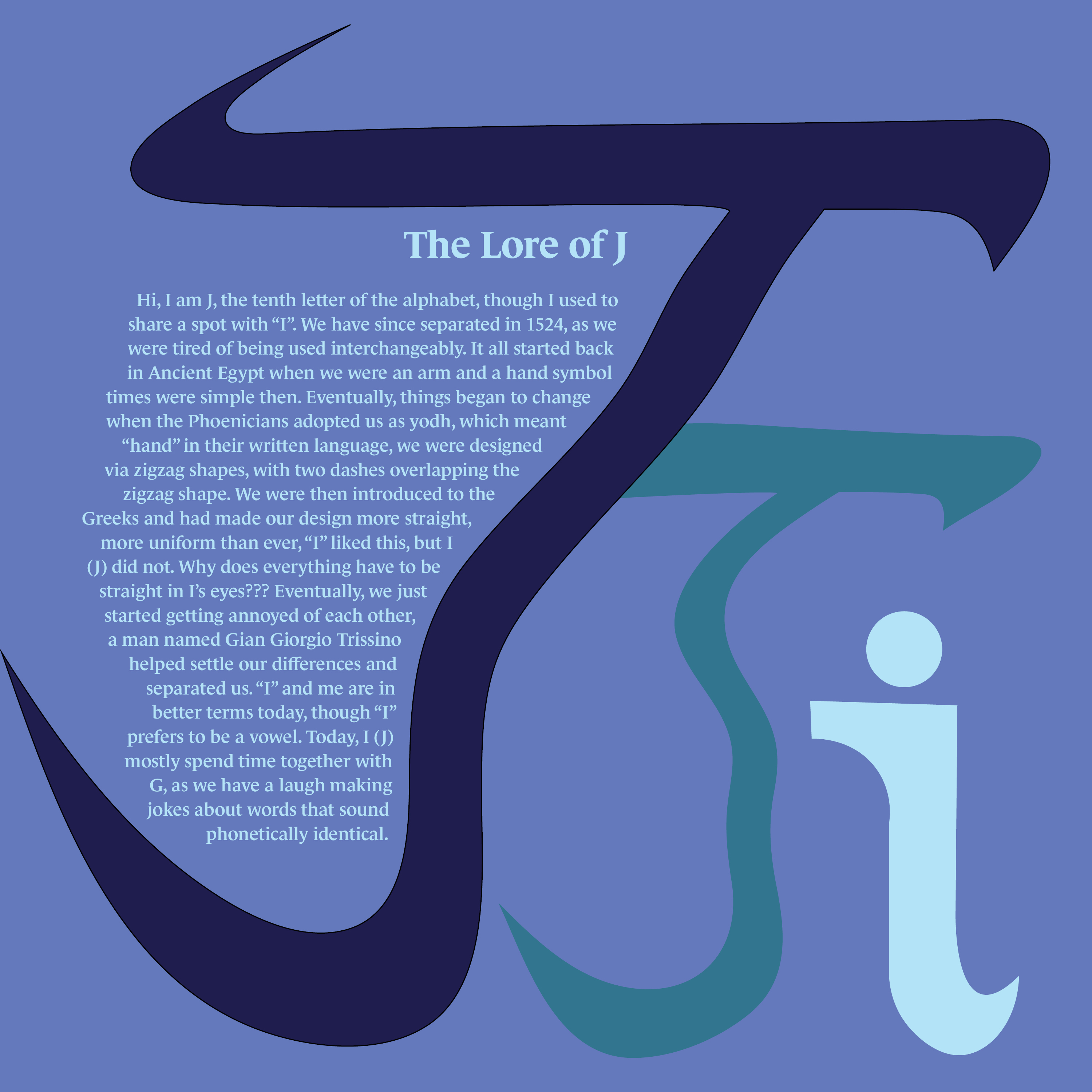
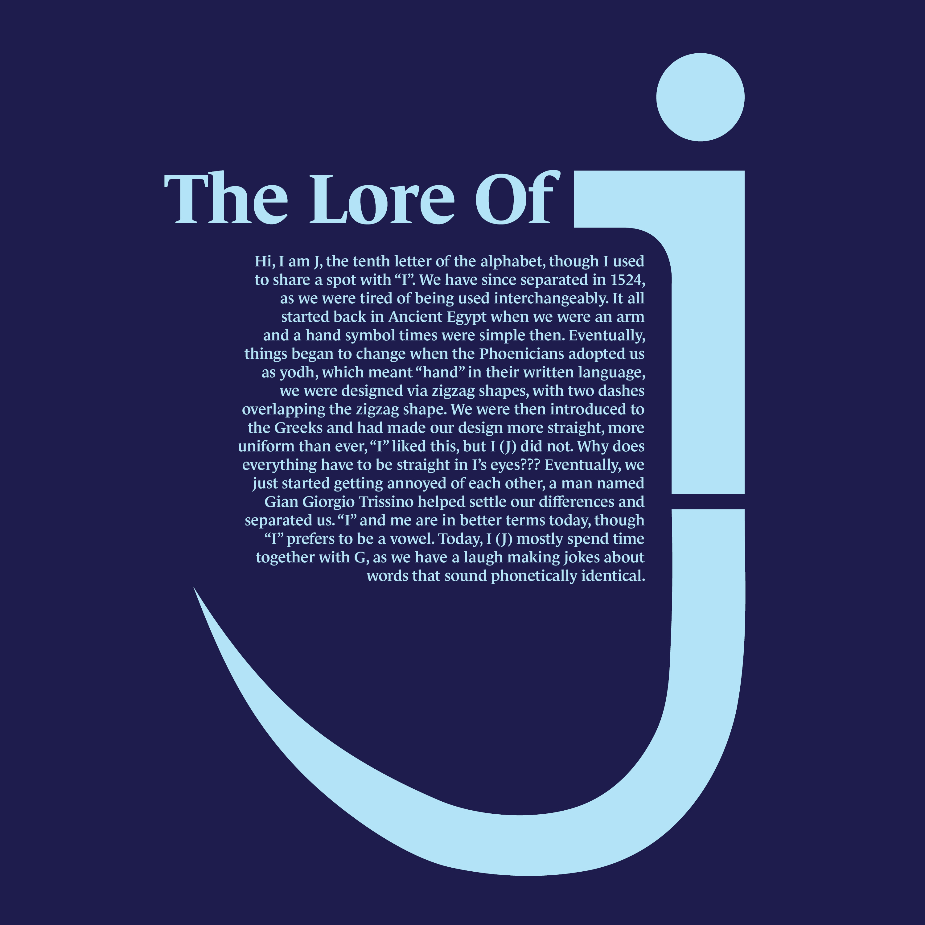
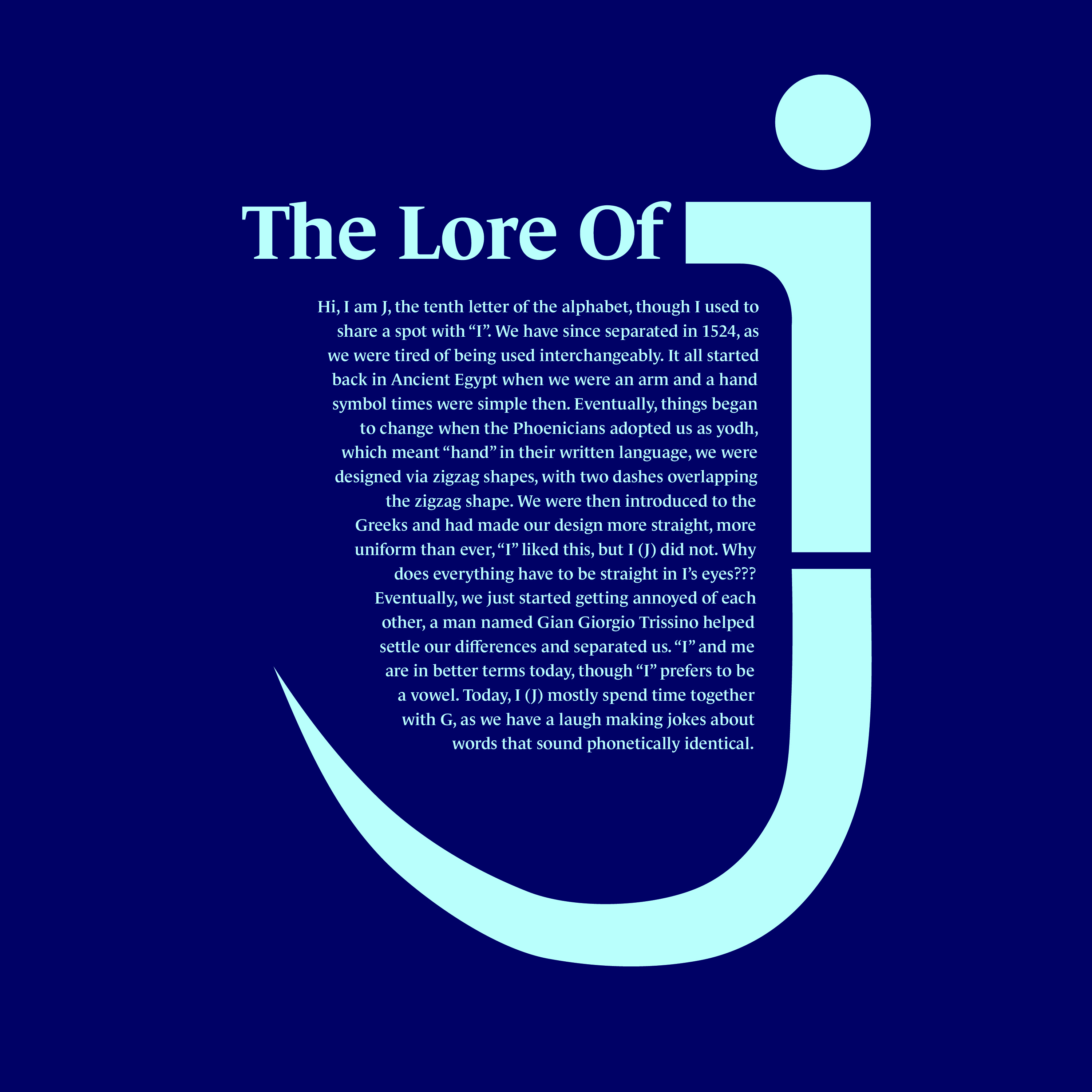
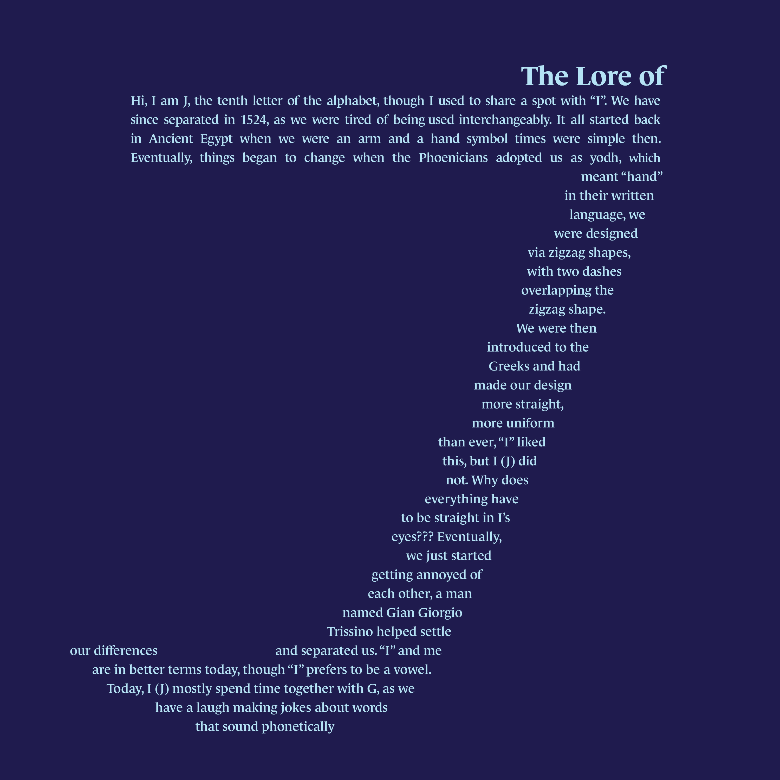
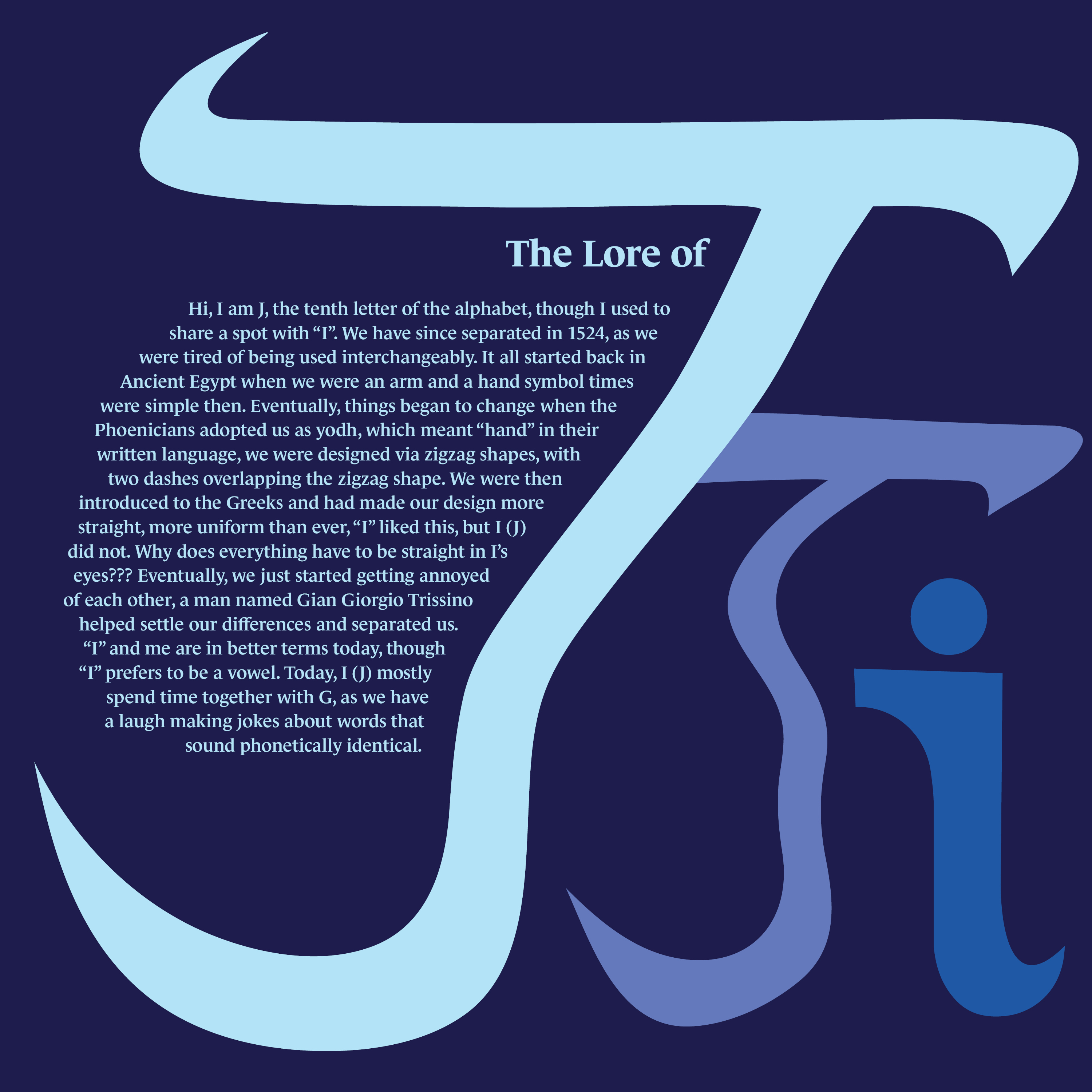
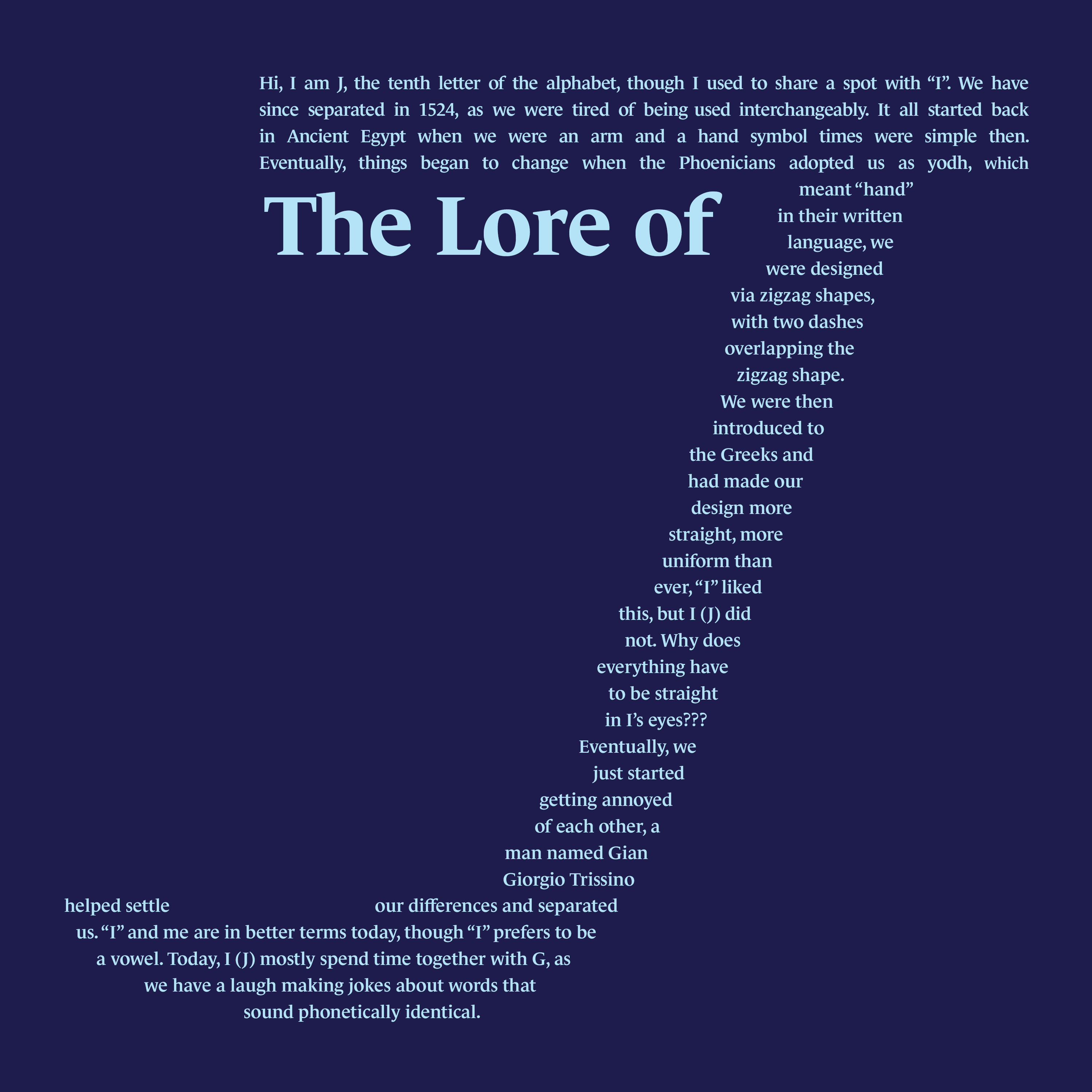
The Lore of J Poster Series features the history of the letter J in 3 hierarchies. This poster series tells a story about J’s grievances with the letter I, culminating in their separation. The design of the posters references the events of the story of how the letter j transformed from the letter i. The headline design represents the separation of i and j, with a lowercase j being split into two. The blue colors represent depression the letter I caused to the letter j. As the colors get darker into the background of the poster and the i objects being the darkest blue being the source of the depression. The body copy design is the story forming a letter j using a custom text box. Le Monde Std Bold and Demi-Bold to gives the typeface a sophisticated diary feel.

Symbol design sketches

Headline design sketches

Body Copy design sketches

Color & Type Study
Symbol Design Version 1
Headline Design Version 1
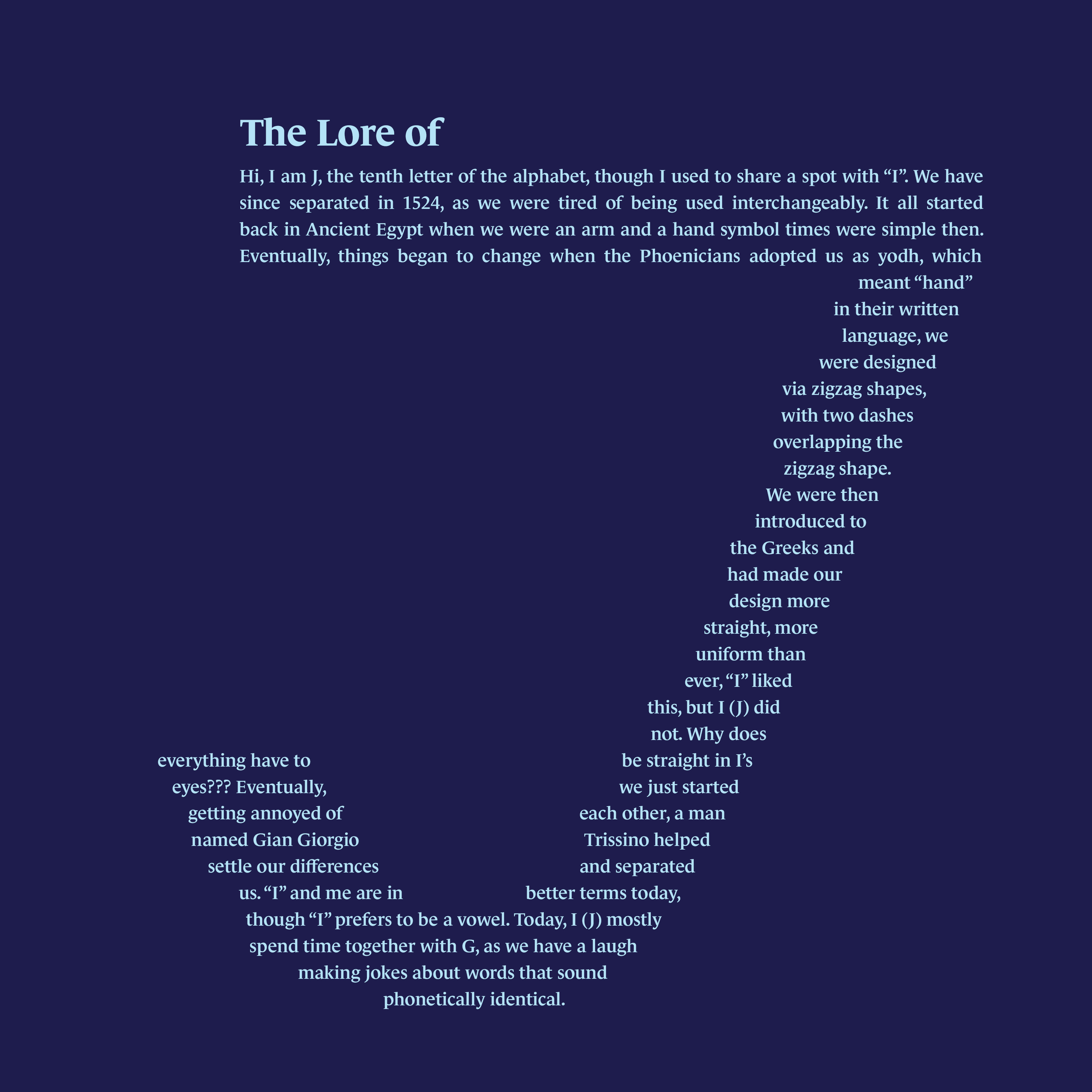
Body Copy Design Version 1

Symbol Design Version 2

Headline Design Version 2

Body Copy Design Version 2

Symbol Design Version 3
Headline Design Version 3
Body Copy Design Version 3
Symbol Design Final

Headline Design Final
Body Copy Design Final